Consolidated Office Design
with room for future growth


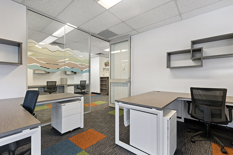

Previously, they had been working remotely in different locations, which made collaboration more difficult. With work steadily increasing, they wanted to make sure they would not outgrow this new space. The existing tenancy was split in two, one side for the current business, while the other side would be leased out until it was needed for additional staff.
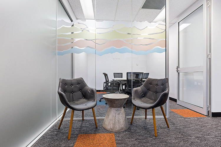
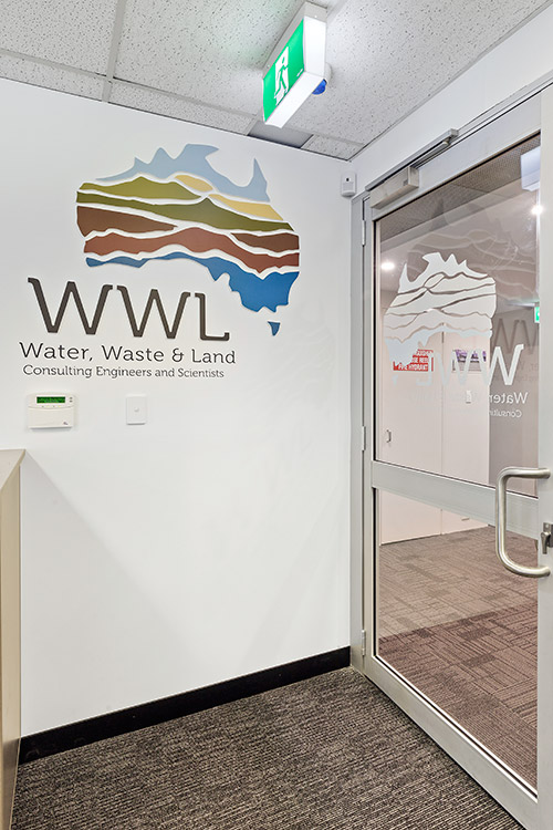
Although this was a smaller tenancy, there still needed to be a clear delineation between entry, waiting and staff areas. The client also wanted a light and bright space that incorporated the colours of the logo, which represent Water, Waste and Land.
Budgets and timelines were met and the client was more than happy with his new office space.
 Jill will work with you to create a solution that furthers your business objectives and promotes a more productive working environment.
 Vetwest Ellenbrook